Need help in using our WordPress theme?
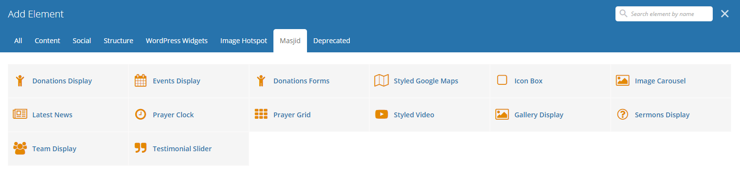
With Masjid comes many custom shortcodes for (Visual Composer) VC that are used to show content created in Masjid.
Below you will find short information about this Visual Composer elements:
|
|
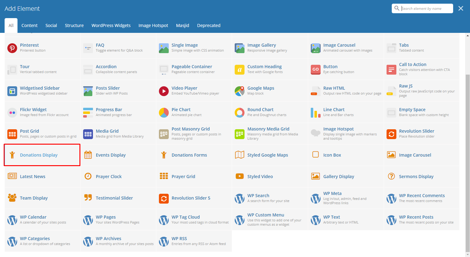
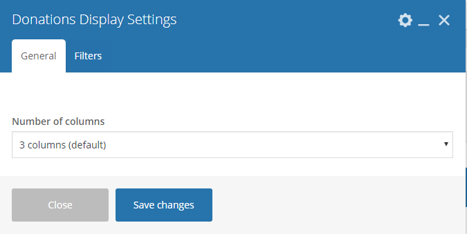
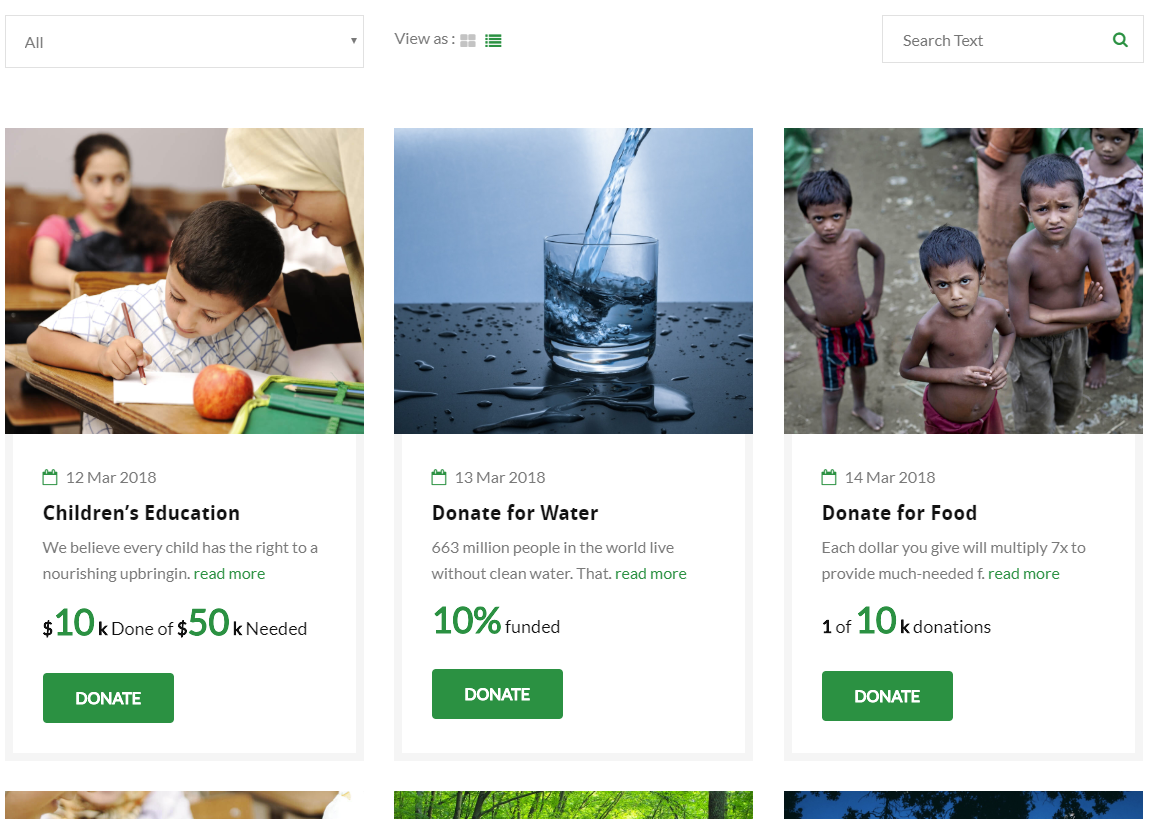
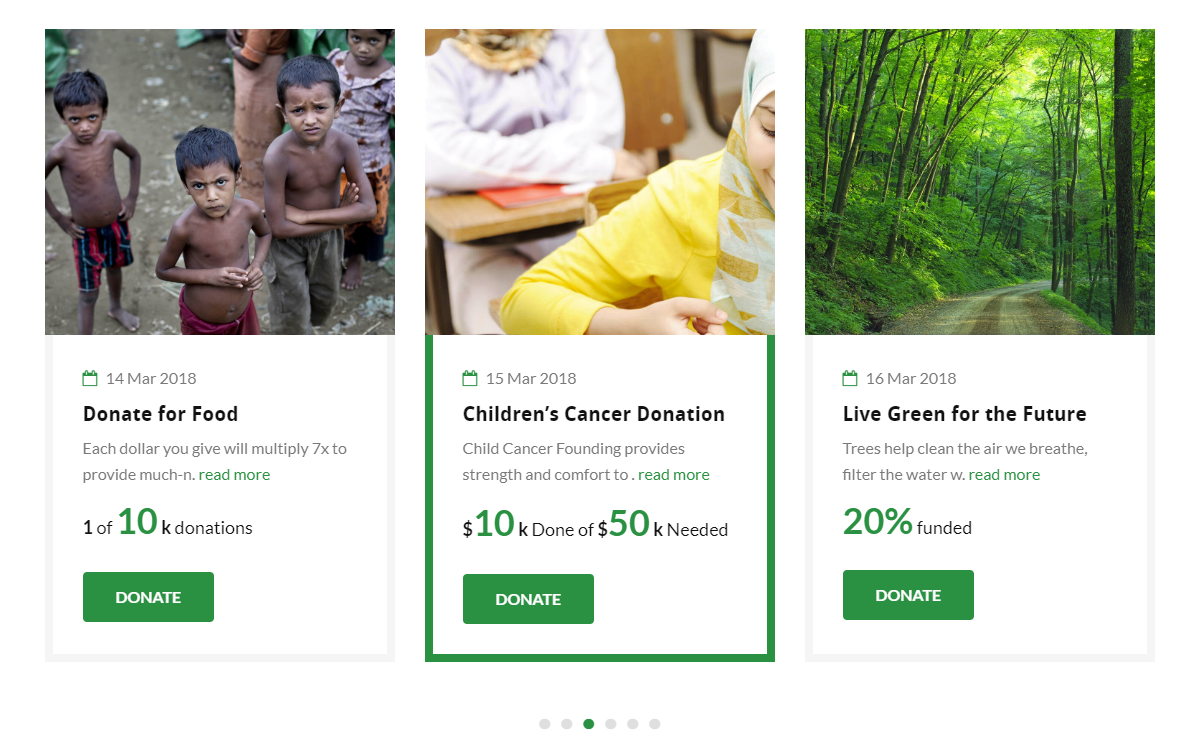
This element will let you display Donations’ items in a grid view.
|
|
|
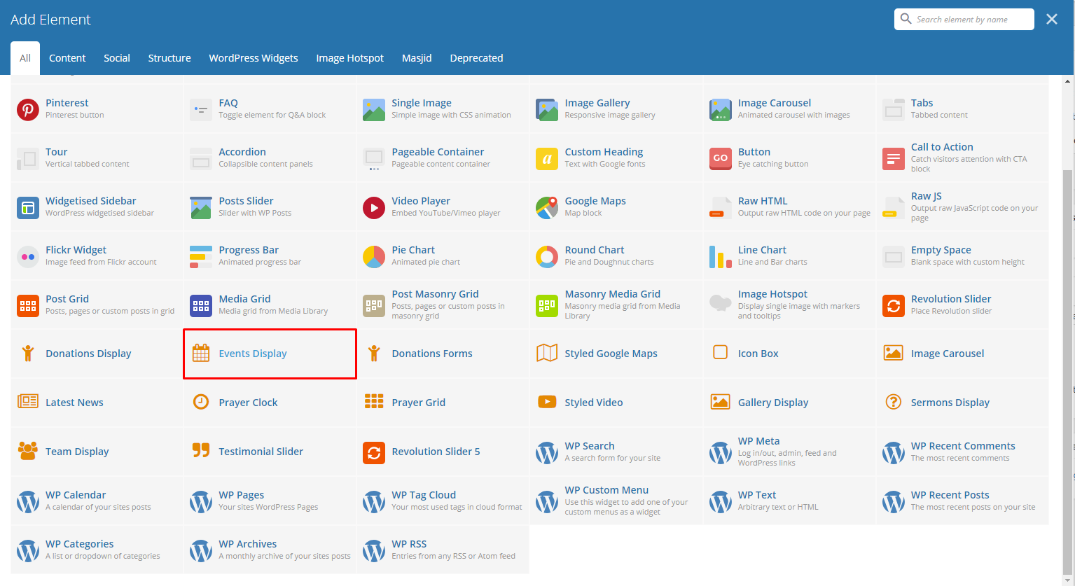
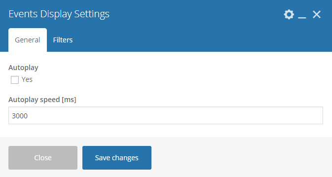
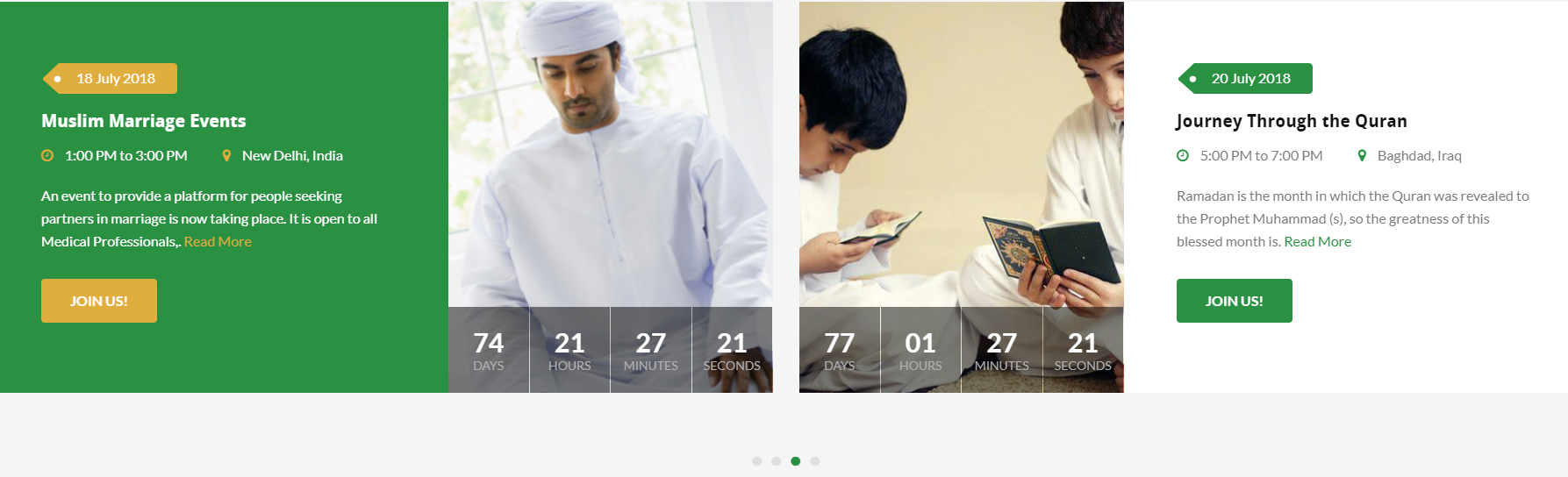
This element will let you display the Events items in a slider.
|
|
|
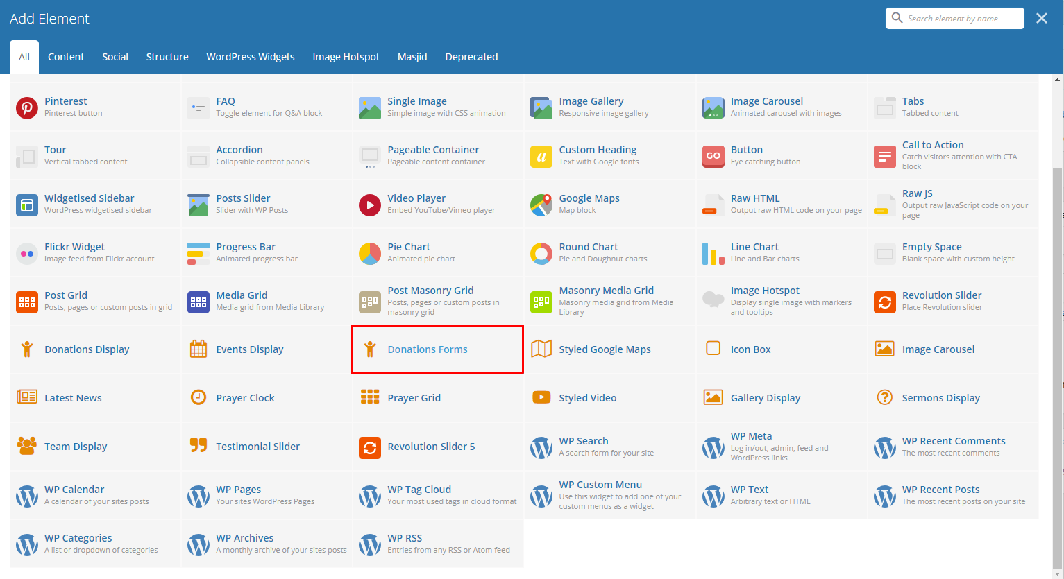
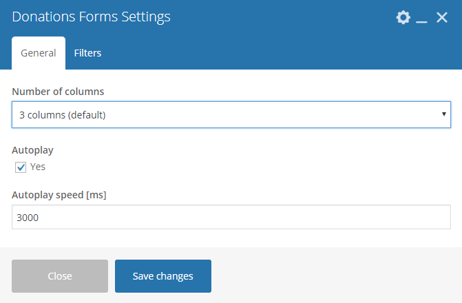
This element will let you add the Donations items in the page.
|
|
|
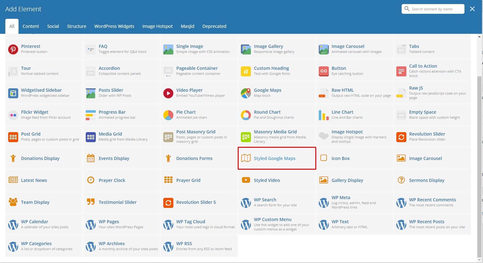
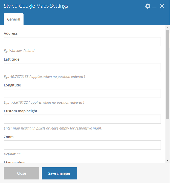
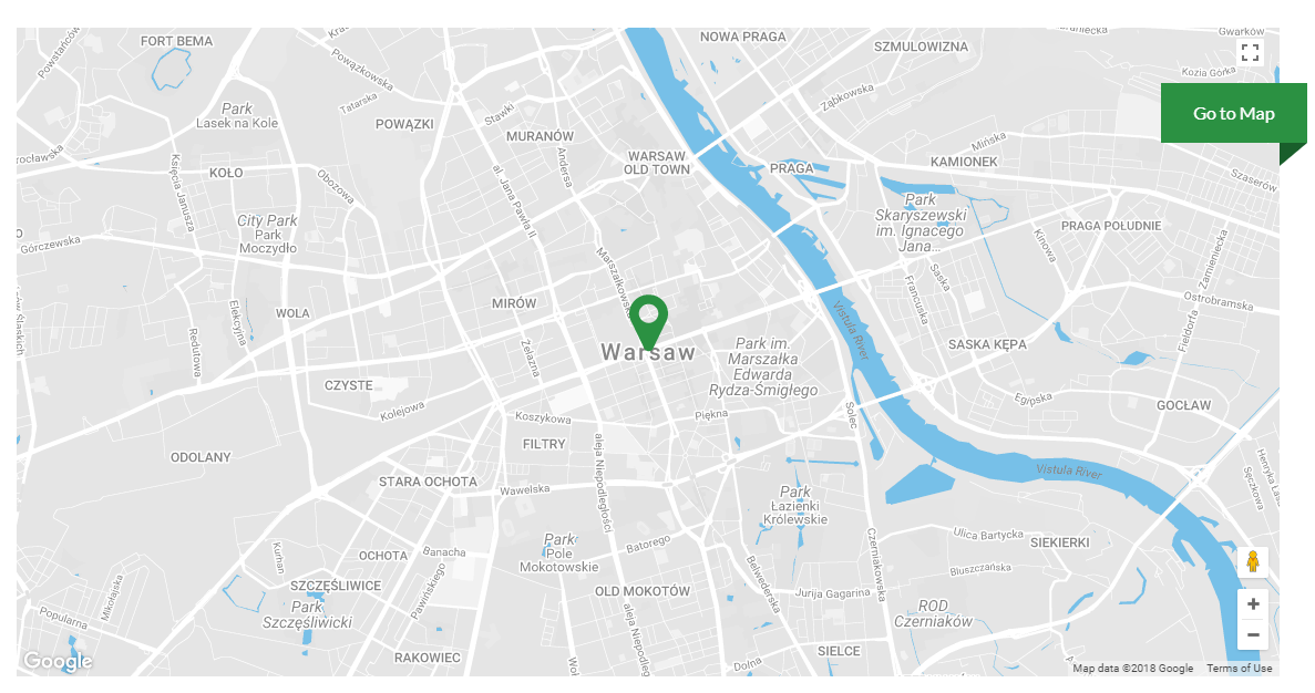
This element will let you add a google map with a specific address.
|
- Address - The complete address of the location to show in the map.
- Latitude - Latitude coordinates of the location.
- Longitude - Longitude coordinates of the location.
- Custom map height - Set the height of the map. You can leave it blank for a responsive map.
- Zoom - Set the zoom in of the map.
- Map marker - Choose an image to use as the map marker.
- Map style code - Code for a customized map marker.
|
|
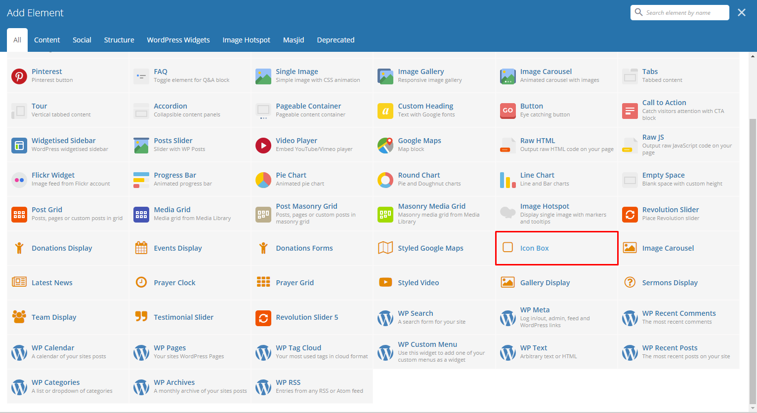
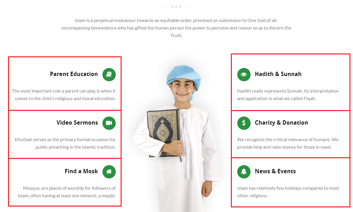
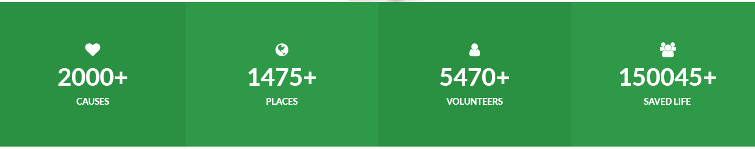
This element will let you create an icon box that displays an icon with title and description or a counter.
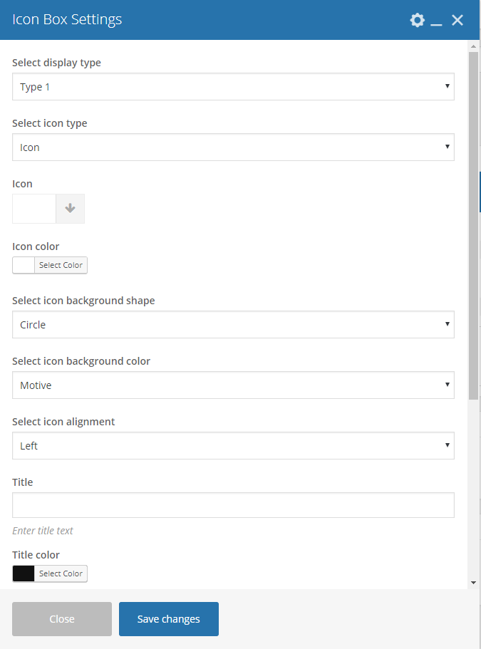
|
Select display type - Type of icon box that will be shown.
Type 1
Select icon type - Choose whether to show an image or an icon.
Icon
- Icon - Choose an icon to show in the icon box.
- Icon Color - Color scheme of the icon.
Image
- Icon image - Choose an image to show in the icon box.
Select icon background shape - Background shape of the icon.
Select icon background color - Background color of the icon.
Select icon alignment - Location where the icon will show.
Title - Title of the Icon Box.
Title color - Font color of the title.
Select title alignment - Location where the title will show.
Description - Text description of the icon.
Description color - Text color of the description.
Select description alignment - Location where the description will show.
Type 2
Select icon background color - Background color of the icon.
Select icon type - Choose whether to show an image or an icon.
Icon
- Icon - Choose an icon to show in the icon box.
- Icon Color - Color scheme of the icon.
Image
- Icon image - Choose an image to show in the icon box.
Select icon alignment - Location where the icon will show.
Title - Title of the Icon Box.
Title color - Font color of the title.
Select title alignment - Location where the title will show.
Description - Text description of the icon.
Description color - Text color of the description.
Select description alignment - Location where the description will show.
|
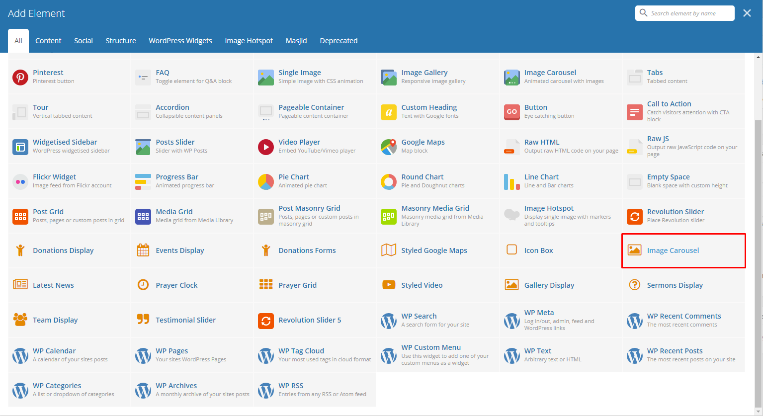
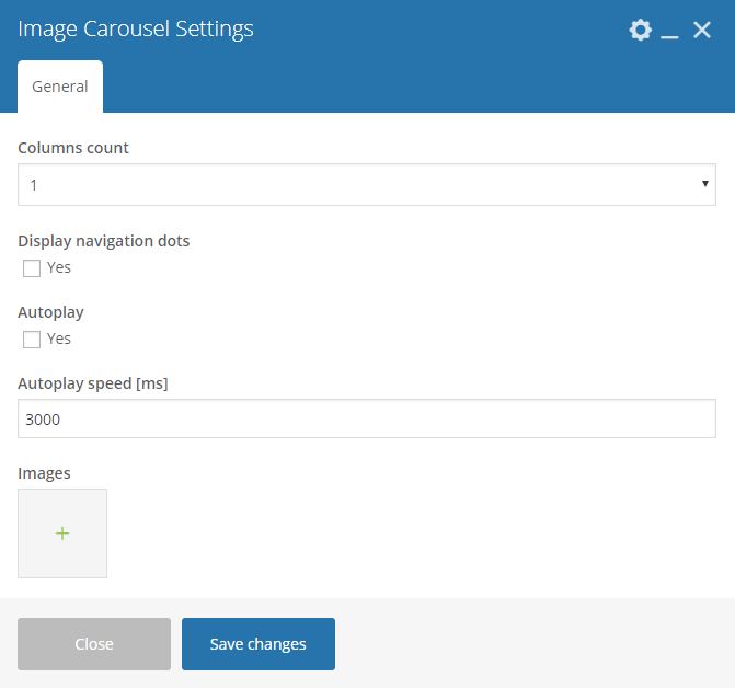
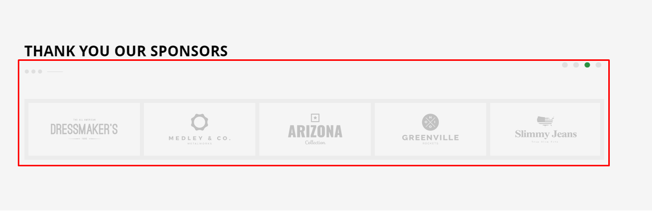
This element lets you add images that can be set to be dynamic.
|
- Columns count - Number of columns in a row.
- Dotted navigation - Option to add a dotted navigation in the slider.
- Autoplay - Option to make the slider move automatically.
- Autoplay speed [ms] - Speed of the slider when moving.
- Images - Images in the slider.
|
|
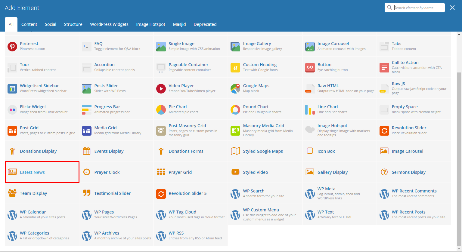
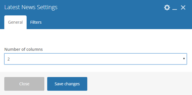
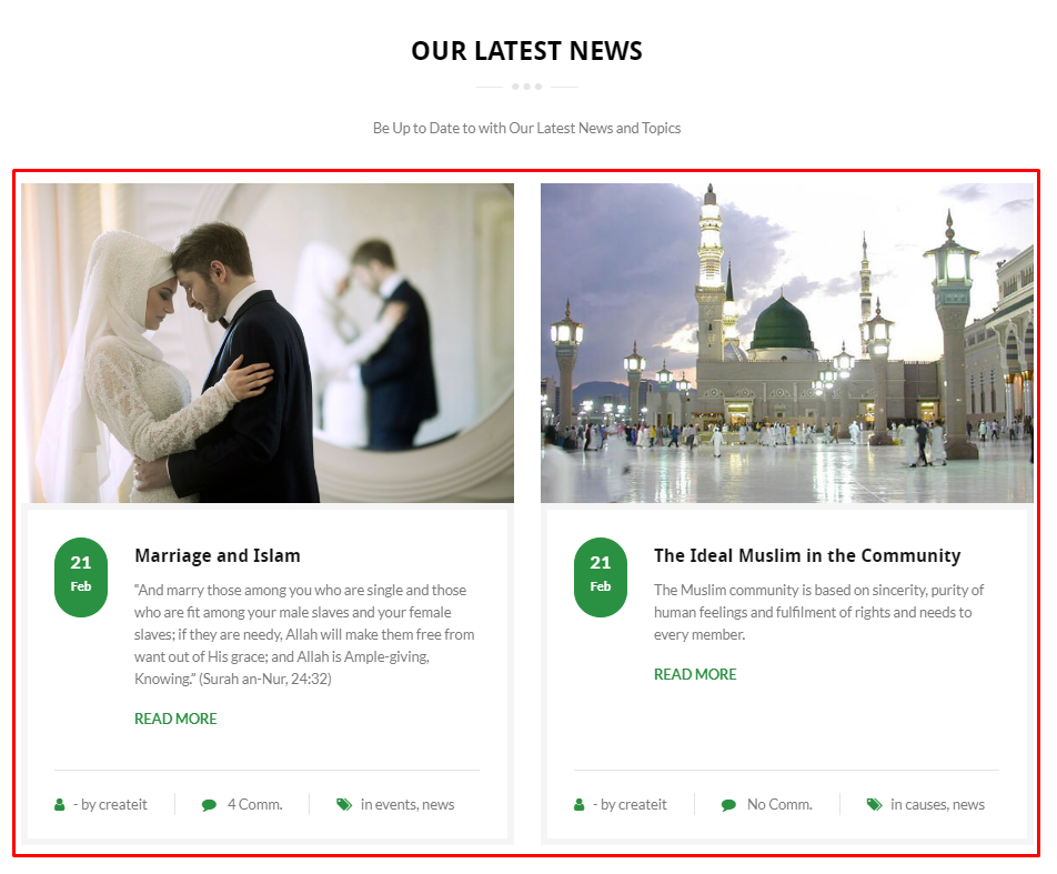
This element lets you add the latest blog posts.
|
|
|
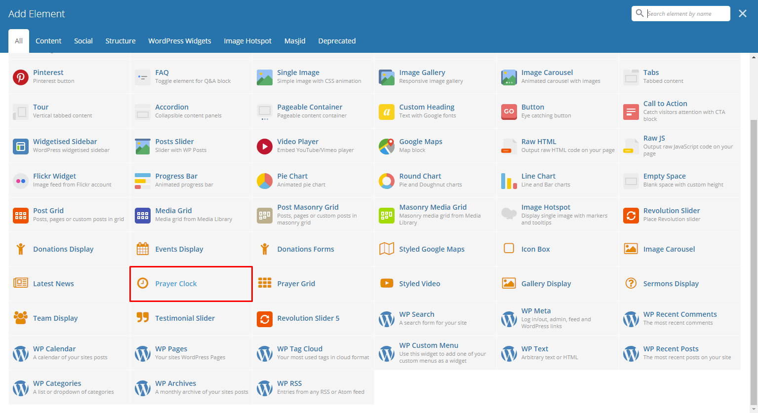
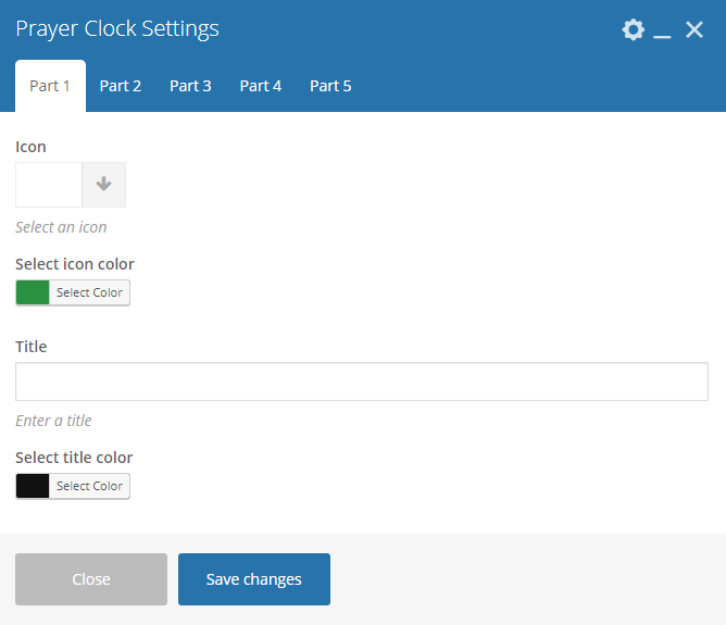
This element will let you add a clock that indicates what prayer is scheduled with icon.
|
Note
The time that this element follows to indicate the scheduled prayer will be based on the time zone which the user’s computer is set.
|
|
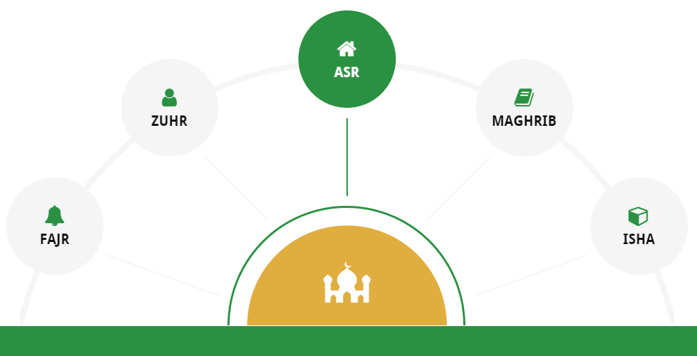
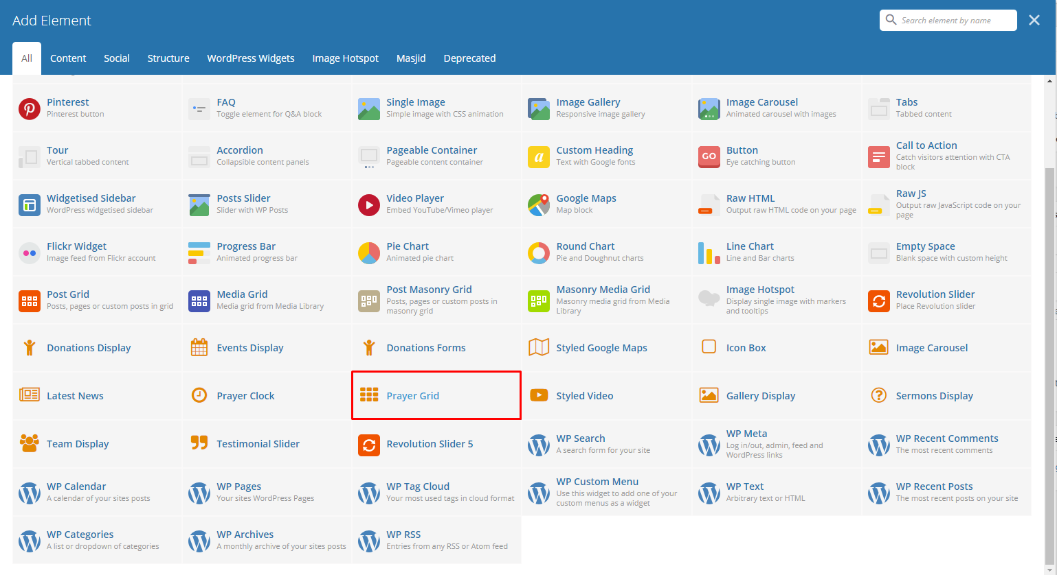
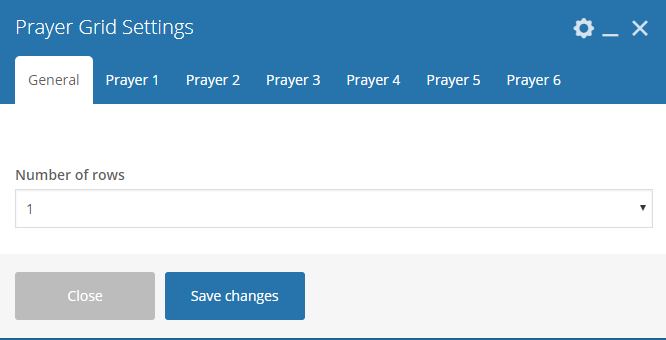
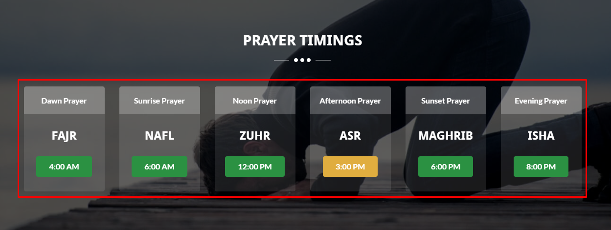
This element lets you a grid for the prayer schedules.
|
Note
The time that this element follows to indicate the scheduled prayer will be based on the time zone which the user’s computer is set.
|
|
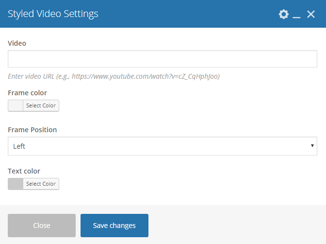
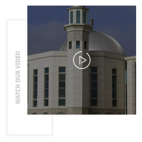
This element lets you a text-link for a popup video. You can add an icon or image beside the text-link.
|
- Video - Link for the video.
- Frame color - Color scheme of the frame.
- Frame Position - Location of the frame.
- Text color - Text color of the text in the frame.
|
|
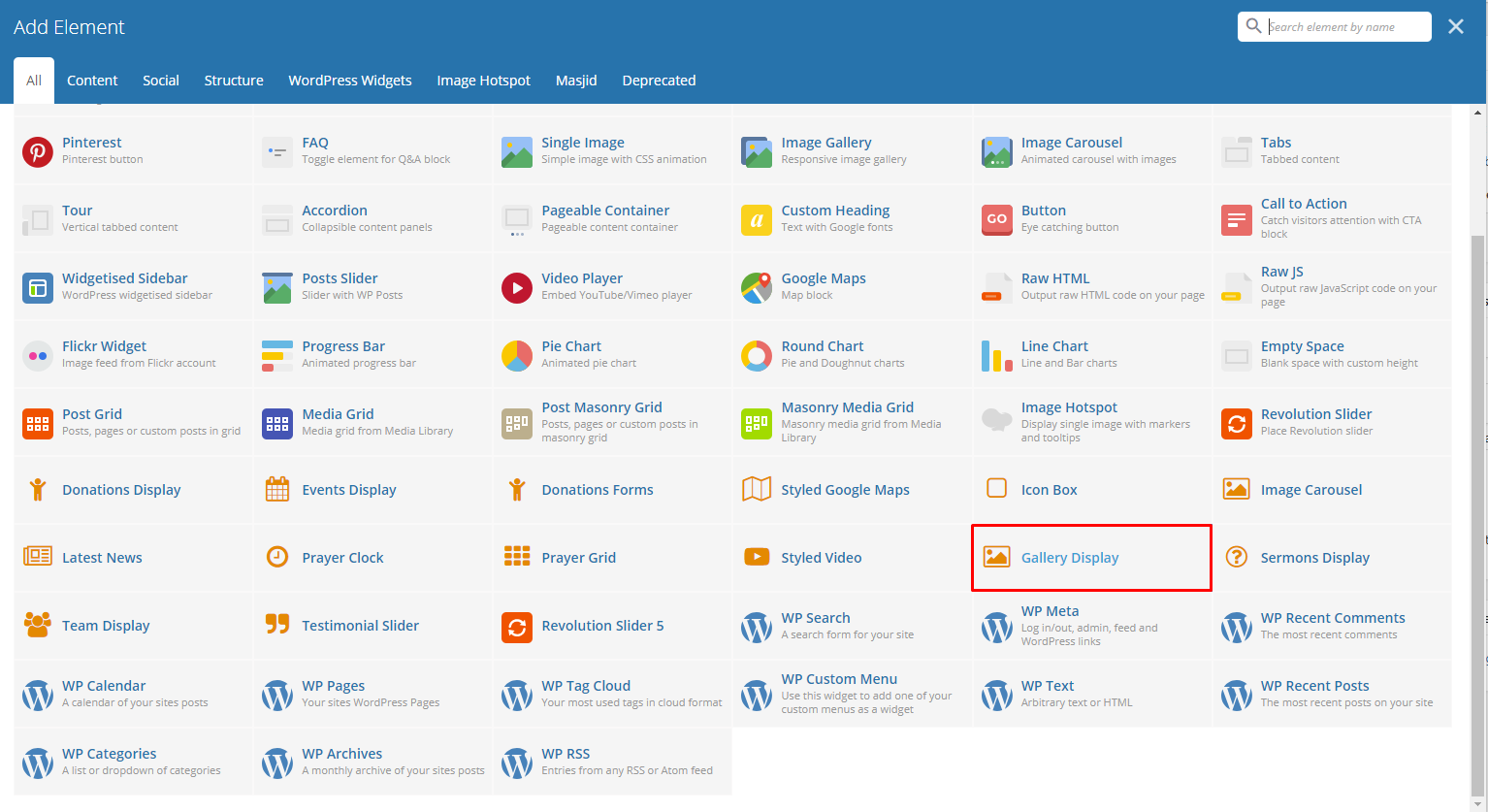
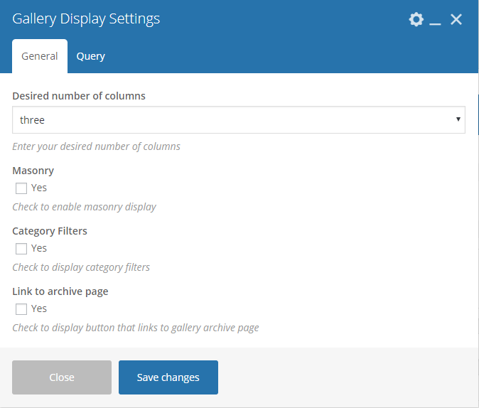
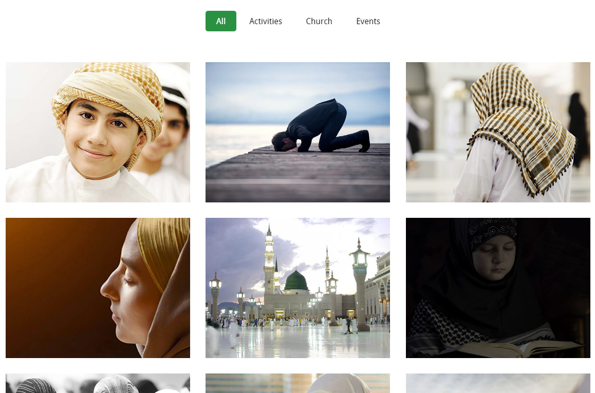
This element will let you show the items in the Gallery post type.
|
|
|
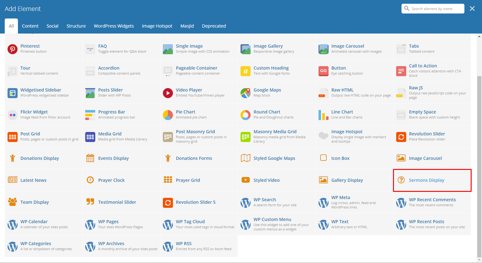
This element lets you show items in Sermons post type.
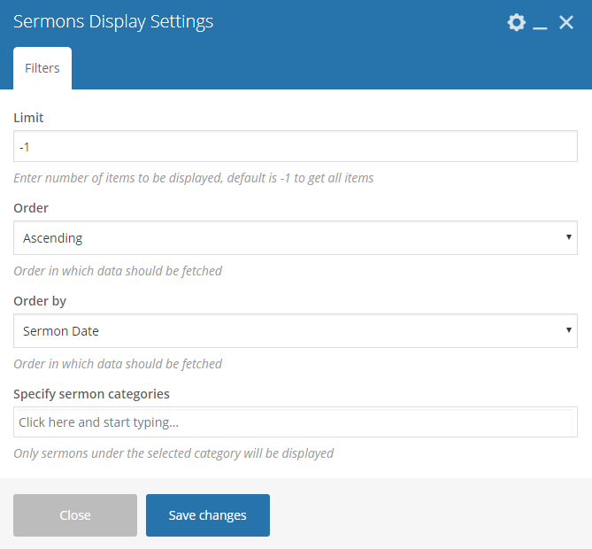
|
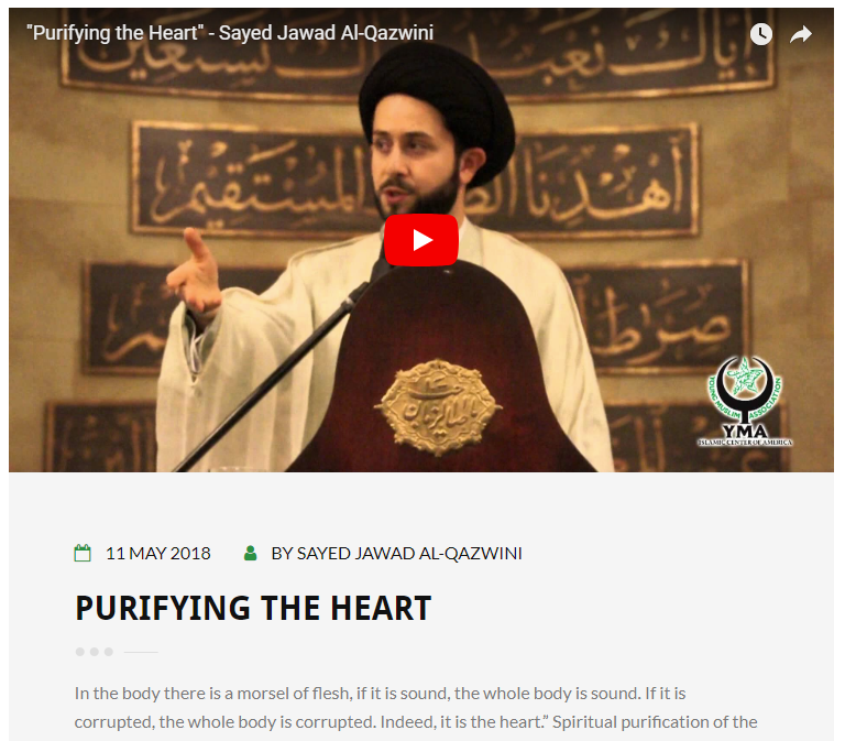
|
Note
To get the same layout as the demo site:
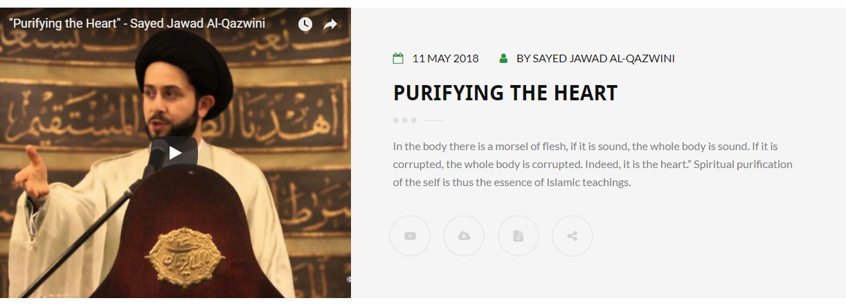
Set the Page template of the page where the sermons are displayed to Full Width Page.

|
This element lets you show items in the Sacraments post type.

|
|
|
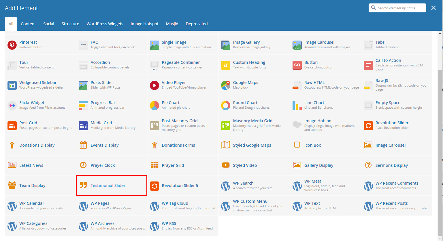
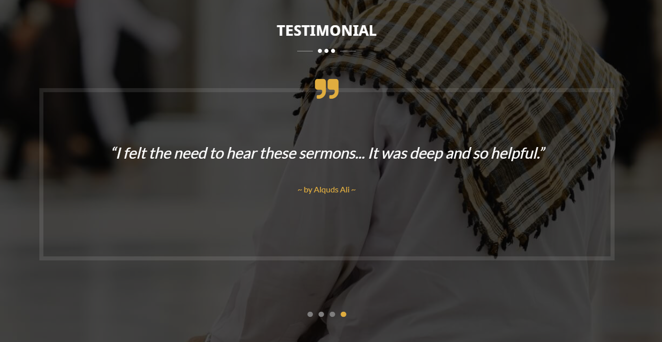
This element lets you show items in the Testimonials post type.

|
|
|
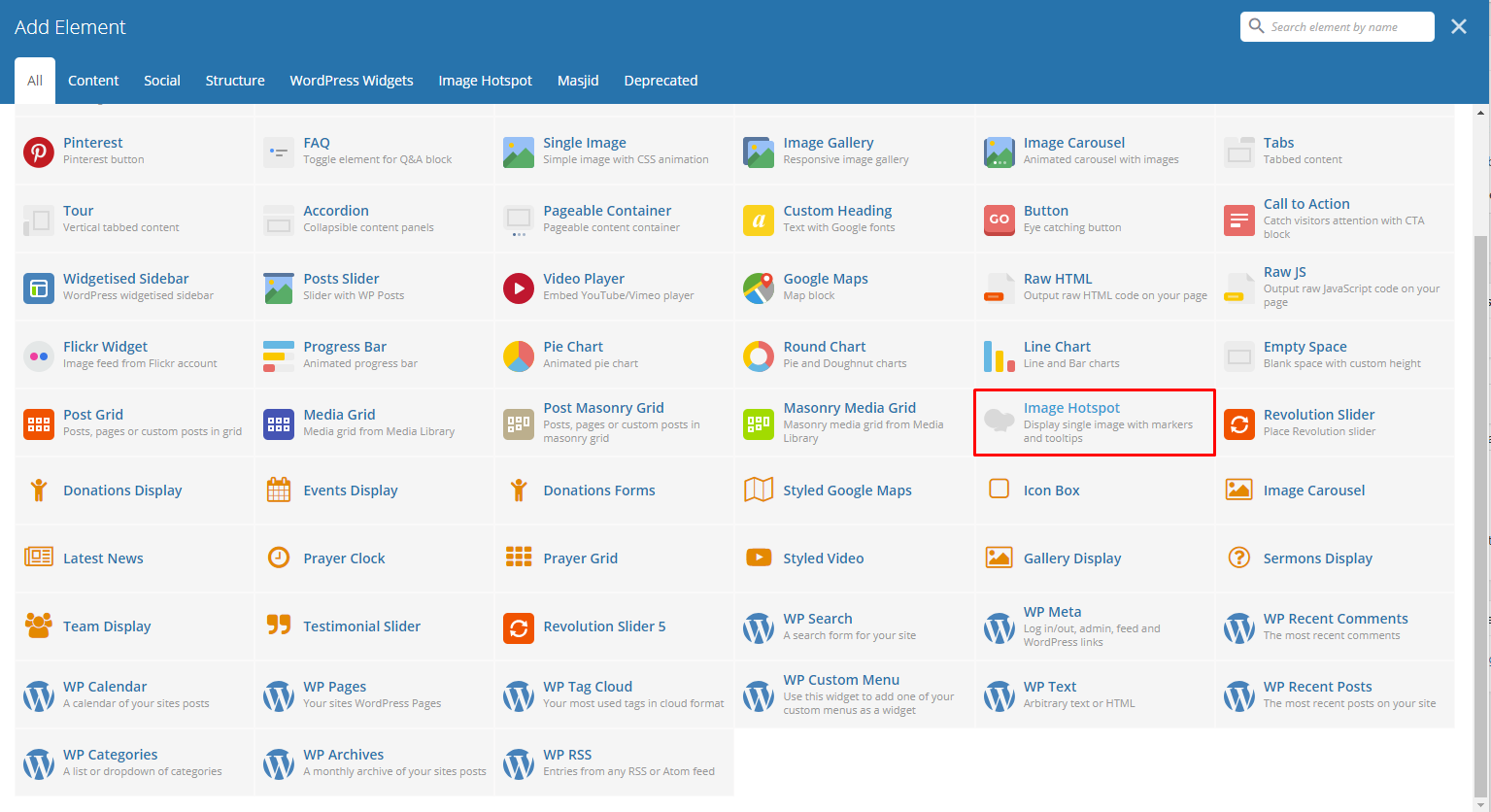
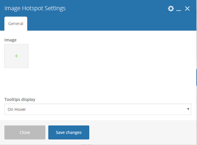
This element lets you show an image with tooltips with descriptions.
|
Note
To add a tooltip click on the area where you like the tooltip to show, and the Hotspot Tooltip Content will show.
|